Peter Saville Wrote the Source Code
How the English Graphic Designer Set the Course For Contemporary Visual Culture
- Text: Adam Wray
- Images/Photos Courtesy Of: Peter Saville
- Photography: Paul Wetherell

Peter Saville takes forever to smoke a cigarette. He reaches, mid-sentence, for a pack—a white pack of Marlboros, a red pack of Gauloises, or a blue pack of Chesterfields, which he smokes alternately—and palms it, pausing only at a thought’s conclusion to extract one. Once lit, it sometimes goes unpuffed for minutes, smouldering on the rim of an ashtray or pinched delicately at its tip like a four-leafed clover. Eventually it’s stubbed out, and the process soon begins anew.
Mike Meiré of design firm Meiré und Meiré, an old friend of Saville’s, likens having a conversation with him to witnessing an act of “social sculpture.” Saville nudges conversation towards performance, and the cigarettes are one small part of the routine. He thinks with his whole body, crumpling to bury his face in his hands when a word escapes him, holding these poses as if choreographed. He reminds me in these moments of a Henri Vidal statue in the Tuileries—Cain venant de tuer son frère Abel—and I wish I had asked him to let me take some portraits.
Saville is still best known for his earliest work: the album covers he designed for Factory Records bands like Joy Division and New Order, which were groundbreaking for their synthesis of punk’s irreverent spirit and modernist design’s formal rigor. Some of them, particularly the cover of Joy Division’s Unknown Pleasures, have transcended their original context to enter a global image lexicon, familiar even to those who have never heard the music they were made to accompany.
Saville’s greatest strength, by his own admission, has always been his sensitivity to cultural currents, and his perspective on visual culture is deeply respected. Visiting the live/work space he shares in London with Anna Blessmann, an artist and his partner of 16 years, it feels charged with pop history—the bust of Louis XIV photographed for the cover of New Order’s "Round & Round" 12-inch sits by the entrance. Saville has cultivated an oracular vibe, leading to an impressively diverse portfolio: art direction for the likes of Yohji Yamamoto and Dior; clothing design for adidas, Y-3, and even the English national soccer team; and, for a decade, from 2005 through 2015, the creative directorship of his home city of Manchester. While he is still actively contributing—just last year he revamped the visual identity of Raf Simons’ Calvin Klein—he says he is now mainly concerned with curating his archive, sifting through 30-plus years of unpublished work in search of an answer to one big question: “What was the consequence of Peter Saville?”

Raf Simons Spring/Summer 2018

This question had occurred to me, too—last July, at Raf Simons' Spring/Summer 2018 show in New York City. Deep in Chinatown, underneath the Manhattan Bridge, Simons showed a collection of expressionistically shredded menswear with a cyberpunk edge, and included was a series of garments bearing imagery Saville had created for Factory nearly 40 years prior. This was not the first time Simons has used those graphics. His Fall/Winter 2003 collection contained similar items, many of which are now among the most covetable in his catalogue—military parkas covered in patched and painted renderings of Saville’s imagery now routinely sell for five figures. Why, I wondered, is this world of images still so pervasive?
I put the question to Simons himself, over email. He responded simply: “It is iconic and timeless.” Well—okay, yes. But what does “timeless” actually mean?
Saville’s trip through visual chronology really began just months before he was set to graduate from Manchester Polytechnic’s graphic design program in 1978. Never a serious student, Saville had managed to complete most of his degree program without setting foot in the college library. Finally, he was forced to visit in search of a book that a friend had declined to loan him. It was there and then that he discovered the source material that fueled his early work.
“I found a corridor of books that were the canon of graphic history. It made me realize that this graphic history, which is predominantly a 20th century phenomenon, came straight out of the significant art movements of the late 19th and early 20th century. If you go on a contemporary graphic expedition, you get to Malevich’s Black Square. It’s like Indiana Jones meets 2001. And you have to sit down. I sat down in late November 1977, around about this time, 3 o’clock in the afternoon—exactly 40 years ago. And I realized, in that moment, that I knew nothing. I really knew nothing of cultural history. And I’d better start to learn.”
Saville began feeding the graphic canon into his own work, lifting historical elements and placing them in a contemporary context. He was convinced of the two-pronged potency of this method—it allowed him to communicate with the handful of Mancunians who picked up his references, and because of the canonical nature of the works he was reusing, he was confident in their intrinsic aesthetic value. So, even if no one picked up on the Jan Tschichold allusion on his first gig poster for Factory, they might still appreciate its look, and maybe, whether they were aware of it or not, learn something about typography. “In 78, I thought I knew everything that was happening graphically in the world,” he tells me. “I felt I was pioneering retrieval and transposition—I wasn’t, really. I didn’t know who April Greiman or Wolfgang Weingart were, but they were already exploring these things. But I was doing it in pop culture. I was working more like a fashion designer than a graphic designer. And Factory afforded me the unprecedented autonomy of free design.”
Saville describes Factory as an “autonomous collective,” born in 1978 from the punk-indebted notion that it would operate only in service of music and ideas, with zero regard for profitability. What this meant for Saville, one of its founders and its de facto art director, was creative freedom rarely offered in the field of graphic communications—a profession fundamentally concerned with satisfying clients’ needs rather than pursuing one’s own impulses.
The dimensions of the record sleeve his only constraints, Saville was able to roam freely—particularly when it came to New Order, whose art regularly went to print without the band having seen it. As New Order’s popularity grew, so did the audience for Saville’s explorations with this style of visual quotation. For their 1981 debut, Movement, he simply replaced the text from a poster by Italian Futurist Fortunato Depero with the album’s catalogue information—essentially a logo flip. 1983’s Power, Corruptions, and Lies laid industrial, color-coded iconography devised by Saville over Henri Fantin-Latour’s Basket of Flowers. He sees this first phase of his career as idealistic, a point he returns to throughout our conversations. “It wasn’t just being ironic or making fun of everything. And I think it’s that positive aspect that brokered a certain type of relationship which people are warm about.”
Yohji Yamamoto advertisement by Peter Saville, 1991
By the end of the 80s, Saville’s tendency to focus on projects that were more artistically fulfilling than commercially viable, combined with a recession, had left him insolvent. He had been spoiled by the freedom of Factory, and was unwilling to do work he found uninteresting or distasteful. The idealism of his early work was replaced by a creeping sense of cynical realism, which manifested in a prescient pair of 1991 campaigns he produced for Yohji Yamamoto.
“I had a show in 1990 in Tokyo,” Saville says. “The person who wrote the forward for Nick Knight’s book, Nicknight, Satoko [Nakahara], who was then the editor of Zero 3 Magazine and very good friends with Yohji, took him to the show.” Saville had actually worked on a number of influential catalogues for Yohji through the late 80s alongside Knight and art director Marc Ascoli, but Yohji was up to then unfamiliar with Saville’s own body of work. “It turned out that Marc had never really told Yohji what I did, and he was very interested.”
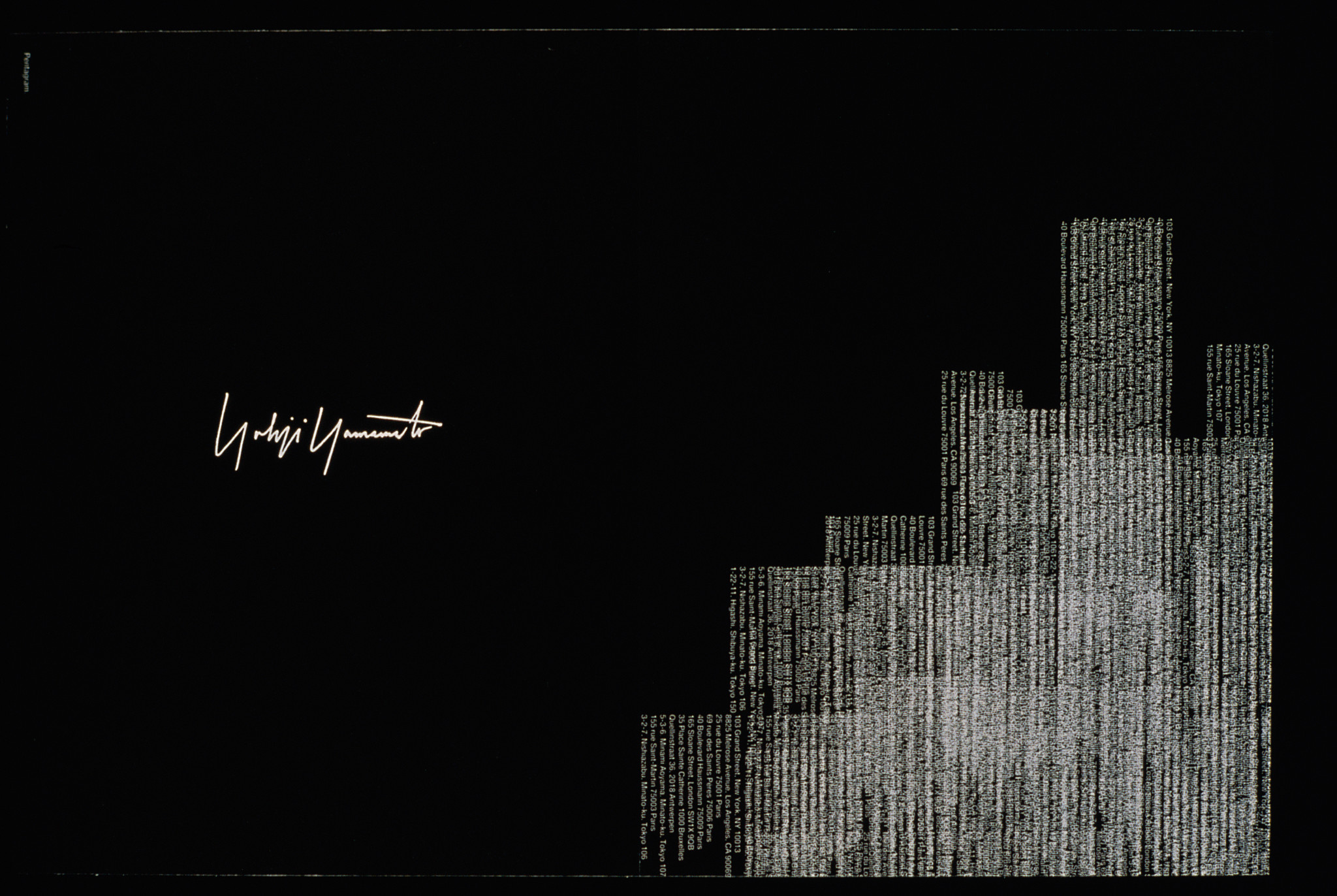
Yohji booked six pages in Nakahara’s magazine, and instructed Saville to fill them however he liked—“No fashion, just do what you feel.” The only restriction was the inclusion of addresses for some of Yohji’s shops. Saville retrieves a copy of one of his monographs from one of his many chock-full bookshelves and flips to a page depicting a cityscape rendered from the tangled, layed text of Yohji Yamamoto boutique addresses. “Yohji loved it. He went to his marketing director and said, ‘You want addresses?’ That was very Yohji.”
The pair were on a similarly disaffected wavelength, and for Fall/Winter 91 Yohji designed a practically unwearable women’s collection made of wood and tinfoil. He invited Saville to art direct his upcoming campaigns. “He wanted me to do them the same way I did record covers. He’d had enough of fashion.”


Both: Yohji Yamamoto Game Over menswear campaign by Peter Saville, Fall/Winter 1991


Both: Yohji Yamamoto Fasching womenswear campaign by Peter Saville, Fall/Winter 1991
Saville’s work reflected their shared discontent. The recession of the early 90s, combined with his own financial challenges, had Saville questioning the global economic structure, and he used this platform to subtly critique the fashion industry. His men’s campaign paired striking stock imagery with non-sequiturs culled from magazines and art books. It was unlike any other campaign being produced at the time, unorthodox for its non-fashion imagery, its oblique, readymade copy, and its overall critical stance. It had a lot in common with the 2017 campaign artist Coco Capitán produced for Gucci, which featured non-specifically evocative sentences hand-scrawled on solid backgrounds accompanied by a Gucci logo, painted across the entire sides of buildings in high-traffic areas of New York and Milan. While Saville's provocations were facilitated by the willful iconoclasm of Yohji himself, one wonders about the impetus behind the recent Gucci campaign. Has it simply taken major fashion brands almost 30 years to adopt this sort of counter-programming?
Saville's work for the women's campaign was similarly obscure, using press photos of the Fasnacht carnival in Basel. Yohji's marketing teams were equally perplexed and incensed by both campaigns, refusing to buy placements for them in certain markets. The same campaigns could run in magazines this week and seem totally of the moment.
After a menswear campaign art directed by Saville, styled by Melanie Ward, and shot by David Sims in Berlin—Sims' first significant fashion commission—was vetoed, Saville and Yohji's relationship cooled. Saville headed to Los Angeles to pursue an ultimately ill-timed new media project that left him, as he puts it, down and out in Beverly Hills.
Jobless, practically penniless, and nearly homeless, Saville spent his days driving around L.A., daydreaming about potential art projects. He returned to London in 1994 with some notion of pursuing them, but found himself intimidated by the work of the ascendant YBAs. “One of the first works I saw when I came back to London was Marc Quinn’s Self,” Saville says, referring to a bust Quinn made of himself by freezing five liters of his own blood in a silicon mold. “I just thought, ‘Fucking hell, I can’t do that. I’ll get my coat.’”

Image from Dior campaign, photographed by Nick Knight, concept by Peter Saville, art direction by Van Tranin consultation, Spring/Summer 1998
He returned to fashion imagery out of necessity, joining forces again with Nick Knight in 98 for a campaign with Dior’s newly-appointed creative director, John Galliano. But Saville found himself unsatisfied working in the industry as it began to be dominated by luxury conglomerates. He had witnessed the invention of branding, which he refers to as a “ghastly hybridization of design and advertising,” and he began to feel that participating in it was unethical—partly due to a sense of guilt that the techniques from his Factory work had been subsumed into its bag of tricks.
“Naively, I didn’t foresee that my liberal quoting of the cultural canon would be taken up as practice with no respect, concern, or authenticity,” explains Saville. “The business-minded generation of the 90s observed the effectiveness of the employment of cultural codes as the new market targeting. They’re the ones who take my early work and similar to service gratuitous consumption. All I saw was people borrowing money to buy things they didn’t need, and a willfulness on behalf of the new, styled-up corporations to sell it to them. They became like drug dealers. Doing Game Over with Yohji, questioning it, that was great. But tarting up carrier bags? It was not interesting to me. I believed that the only place you could actually express your opinion truthfully, if it was questioning the system, would be the art world.”
But Saville struggled to translate his ideas into an active artistic practice, and by the early 2000s, he had indefinitely paused his reinvention. While sorting through his archive in preparation for a "thank you and goodbye" retrospective at London’s Design Museum in 2003 entitled “The Peter Saville Show,” he was contacted by Raf Simons, who was interested in using his imagery for a collection. Had the request come at any other time, it would have been impossible to fulfill—Saville's archive had been scattered across storage units throughout London, and it was only due to preparations for the show that it was all in one place.
Simons discovered Saville's work the same way the rest of his generation had: at the record store. “I became aware of Peter when I bought records he did,” Simons explains. “I think I was 17 or 18. We relate to each other’s visual language,” he continued. Simons and his team came from Antwerp to pore over the archive and left with photographs of pieces they might use.
Saville had no idea what to expect from Simons, and wasn’t even present when the collection was revealed. “I didn’t have the ready money to go to Paris. The show came and went. Next thing, I got a video. And I didn’t get it. Particularly the parkas that were this kind of irrational juxtaposition of everything. I thought, ‘Oh my god, what has he done?’ Then Anna said, ‘Well, don’t you think it’s like the way fans do things? They’re just stating their affiliation.’ And I went, ‘Oh, yeah. That’s exactly what they do. Cool.’ What Raf was doing in a way was almost more like documentary.” It was, in essence, not so different from what Saville himself had done at Factory—it was just pulling from a different canon, one that now included Saville.
The show seemed to come and go not just for Saville, but for the rest of the fashion world, too. It earned only one sentence from Cathy Horyn at The New York Times, which focused on “creamy topcoats and suits”—the parts of that collection now forgotten in favour of the Factory pieces. That the collection is now thought of so highly speaks not only to how Simons’ stature has grown, but to the momentum that’s gathered behind the appreciation of Saville’s contributions—due in no small part to a new generation of designers influenced by Simons and Saville equally.

Raf Simons Fall/Winter 2003
There have been many instances of Saville’s work showing up in a fashion context beyond the Simons collections—a 2009 collection from Jun Takahashi’s Undercover, two Supreme collections, etc.—but the designer who most obviously reveals the downstream effect of Saville’s influence is Virgil Abloh. The current season of Off-White includes hoodies emblazoned with the Mona Lisa, accented with prints of DIY, teenage bedroom-looking tape strips—an acerbic visual quotation that takes Saville’s technique and drops a cinder block on the accelerator.
Abloh considers Saville a kindred spirit. “Between Peter Saville and Tom Sachs, those two people have had the biggest impact on the latter part of my career, in terms of creative thinking and mentorship,” he tells me over the phone. "I feel like we're the same person, but we look opposite, and we're 30 years apart.”
Abloh continues: “When I’m doing Kanye West’s album covers, that’s music of a generation, and I was fortunate enough to work on packaging it. Same with Peter. So, when Raf uses Factory Records and puts it on a perfect silhouette, it’s like, warp speed of importance. I wouldn’t be a designer had I not seen that poignant work. One of the most coveted things I own is a fishtail parka from that collection.”
Streetwear, and therefore much of contemporary fashion, would not exist as it does without Saville influence. Abloh’s ascent represents the maturation of the second generation of designers to follow in Saville’s footsteps. Like Saville, Abloh began his career designing album covers and transitioned into fashion, but with the advent of the streaming era marginalized the impact of album art, the next generation might skip that first step entirely. Had Saville been born 30 years later, it’s likely his first work would’ve been on a t-shirt rather than a record sleeve. He sees fashion objects, from sneakers to handbags, as having replaced record covers as the young person’s first collection, filling the void left by the decline of music as a physical medium. And he is uneasy about the shift: “I’ve often likened fashion and image in the 60s as being like LSD—a little bit dangerous, but for many people expanding of their horizons. And now it’s like crack.” He mentions that the first time he met Abloh, he expressed some bewilderment that there wasn’t a greater youth resistance to fashion. “Why aren’t we seeing some interesting young people saying no? Why aren’t they all just walking around in blue and rejecting it? That kind of blew his mind.”

adidas adicolor sneaker by Peter Saville, 2006
Saville is right—the cadence of consumption has increased exponentially over the past 40 years, and the techniques he pioneered have been and will continue to be corporately abused, in ever more insidious and inane ways. And there are real questions about how far this concept of nested referentiality can be pushed before it falls apart completely. But the question of how to save a society hellbent on consuming is bigger than any one discipline, and there is room here for optimism—designers like Abloh are also directing the teenagers who look up to them towards their own creative pursuits. Saville himself is a testament to the notion that it just takes one person with the right idea, on the right platform, at the right time to massively shift the course of visual culture.
In Berlin, on the exterior of the Bauhaus-Archiv, the source of so much early inspiration for Saville, there is a sign inscribed with a four-line poem:
EXTEMPORALE ZONE
REPRÄSENTATION DER EWIGKEIT
IN JEDEM AUGENBLICK
UCRONIE VOR UTOPIE
EXTEMPORAL ZONE
REPRESENTATION OF ETERNITY
IN EVERY MOMENT
UCHRONIA BEFORE UTOPIA
"Uchronia" is a concept referring to the idea of hypothetical timelines—alternate histories. It was coined by French author Charles Renouvier for the title of his 1876 novel Uchronia (Utopia in History), an Apocryphal Sketch of the Development of European Civilization Not as It Was But as It Might Have Been. So, I interpret that last line to mean that better worlds are born in dreams.
Perhaps this is what Simons really meant when he called Saville’s work timeless. Those album covers have now introduced multiple generations to a mode of expression that collapses chronology in service of earnest homage—a generative form of fandom.
“History is a very heavy word,” says Meiré. “But nevertheless Peter did something which could stay. He did something which is iconic in communicational structure.” A 19th-century flower painting sits with post-industrial hieroglyphs, and it produces a retro-futuristic frisson that also reintroduces a classic from another era. When a designer flips the logo of a international conglomerate, they’re making a joke, but they are also imagining a fictional world of scrambled power structures. These processes are now foundational tools for practitioners in all visual fields. Saville’s impact on the way our world looks is still evolving.
Adam Wray is a senior editor at SSENSE. His writing has also appeared in Vogue, T: The New York Times Style Magazine, The Fader, and more.
- Text: Adam Wray
- Images/Photos Courtesy Of: Peter Saville
- Photography: Paul Wetherell

